
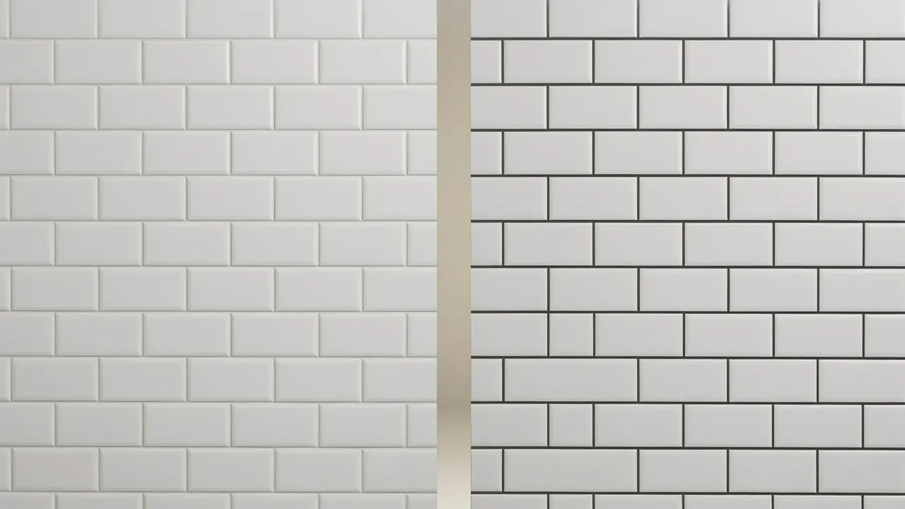
Grout colour is the most underestimated design decision in any Melbourne tiling project. Homeowners spend weeks selecting the perfect tile, scrolling through inspiration boards, visiting showrooms, bringing samples home — and then choosing the grout in five minutes at the tile shop on the way out the door. The result is often a room that looks slightly off without anyone being able to say exactly why.
The grout joint is visible in every part of every tiled surface. In a standard bathroom with 300x300mm floor tiles and 300x600mm wall tiles, there are several hundred linear metres of grout joint in the room. The colour of those joints — whether they blend with the tile or contrast against it — fundamentally changes how the tiles read, how large the room feels, and how much maintenance the surface requires over the next fifteen years.
This guide gives Melbourne homeowners a practical framework for grout colour selection across every room type, with specific advice for the common combinations Ali Star Tiling installs most frequently across the western and northern suburbs in 2026.
Why Grout Colour Matters More Than Most Melbourne Homeowners Realise
Before the room-by-room guidance, here are the three reasons grout colour deserves more than five minutes of consideration.
- It changes how large the room feels. Matching grout (same or very similar colour to the tile) makes the tile surface read as a single continuous plane, visually expanding the space. Contrasting grout emphasises each individual tile, creating a grid effect that can make the same space feel smaller and busier. In a small Melbourne bathroom, this difference is not subtle.
- It determines the maintenance commitment. Light grout in a high-use wet area is a permanent cleaning obligation. White grout between floor tiles in a shower or laundry accumulates soap residue, mineral deposits, and mold that no amount of cleaning will permanently resolve — eventually the grout discolours to a tone between cream and grey regardless of effort. The grout colour you choose today is the colour you will be maintaining for the next fifteen years.
- It is extremely difficult to change after installation. Regrouting (removing existing grout and applying new grout) is possible but time-consuming, expensive, and carries a risk of scratching tile faces during the removal process. Choosing the right grout colour before installation is far less expensive than regrouting because of a regret. Grout colour is one of the few tile decisions that is genuinely hard to reverse.
The Grout Colour Spectrum: From Matching to Contrasting
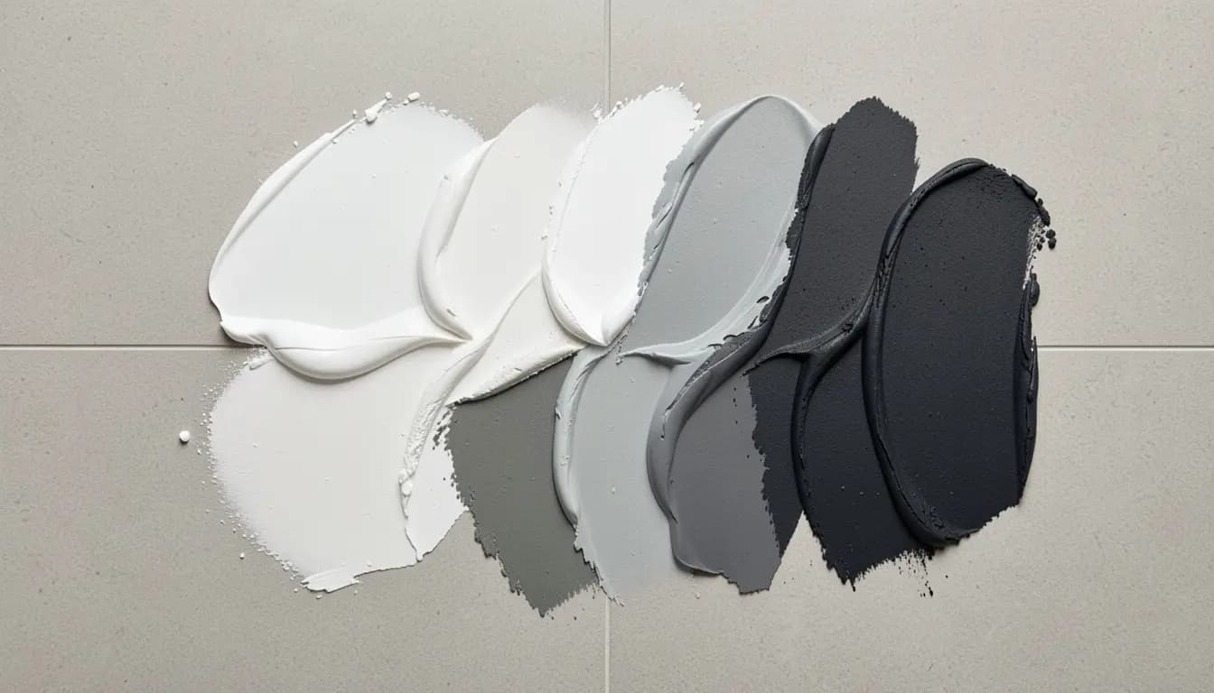
Every grout colour decision sits somewhere on a spectrum from fully matching (grout is the same or very similar colour to the tile) to fully contrasting (grout is significantly different in tone to the tile). Understanding what each end of that spectrum produces helps Melbourne homeowners make an intentional choice rather than a default one.
| Grout Approach | Visual Effect | Best Application | Maintenance | Most Common Regret |
|---|---|---|---|---|
| Exact match (grout = tile colour) | Seamless surface — tiles appear as a continuous sheet. Minimises the visual grid. The room feels larger and more open. | Large-format tiles where minimal grout line is the goal. Prestige bathrooms. Open-plan living floors. | Easier — dirt is less visible against the same tone as the tile. | None — this is almost always the right choice for large-format tiles. |
| Tonal match (grout 1-2 shades darker than tile) | Subtle definition of each tile without a strong grid. The most forgiving and versatile approach. | Most Melbourne bathroom and kitchen applications. Works with almost any tile and context. | Good — slight darkness hides minor soiling without appearing dirty. | Rarely regretted, this is the safest grout choice for most Melbourne applications. |
| Mid contrast (grout notably different but not opposite) | The grid is visible and deliberate. Creates pattern emphasis. Can look very considered or very dated depending on execution. | Patterned tiles where the tile shape is a feature. Encaustic and terracotta tiles. Heritage Melbourne homes. | Moderate — the contrast makes soiling visible but the darker tone hides some discoloration. | Sometimes — if the contrast feels trendy at installation, it can feel dated within 5 years. |
| Full contrast (e.g. charcoal grout on white tile) | Strong grid emphasis. Graphic, bold effect. Each tile reads as a distinct element. | White subway tiles in a contemporary Melbourne kitchen or bathroom. Deliberate industrial aesthetic. | More visible soiling on light tiles. Dark grout on floors shows light dust and footprints. | Sometimes — the boldness that attracts buyers can fatigue over time in a room used daily. |
Q: Should grout colour match or contrast tile colour in Melbourne?
A: The safest and most consistently successful grout colour choice for Melbourne tiling projects is a tonal match — grout that is 1-2 shades darker than the tile. This provides subtle definition of each tile without the strong grid effect of full contrast, works with almost any tile and room type, and is easier to maintain than white or very light grout in wet areas. Full contrast (e.g. charcoal grout on white subway tile) is a valid deliberate design choice but is better suited to homeowners who are confident in that aesthetic and willing to maintain it. Ali Star Tiling advises on grout colour as part of every Melbourne tiling consultation.
Grout Colour by Room: Melbourne-Specific Advice
Bathroom Floor Grout
The bathroom floor is the grout colour decision that most frequently produces regret in Melbourne homes. The shower floor is wet multiple times every day. Soap, shampoo, hard water minerals, and organic material from daily use accumulate in grout joints continuously. The grout colour you choose determines how visible this accumulation is and how quickly the floor looks dirty between cleans — a consideration our bathroom renovation tiling guide covers alongside the full retiling sequence.
- The regret choice: white or cream grout on bathroom floors. White and cream grout on bathroom floors discolours to a greige or light grey within 6-12 months of regular use regardless of cleaning frequency. Melbourne's hard water leaves calcium deposits in grout joints that cleaning products cannot permanently remove. The floor looks perpetually slightly dirty even when clean.
- The practical choice: mid-grey to charcoal grout on bathroom floors. A grout that is mid-grey or charcoal on bathroom floors reads as clean far longer between cleans, shows far less water spotting and mineral accumulation, and — critically — does not reveal the inevitable slow discoloration of grout in a wet high-use environment. In Melbourne bathrooms, charcoal or slate grey grout on the floor is almost always the right choice regardless of the tile colour.
- The exception: epoxy grout in white or light colours. Epoxy grout is non-porous and does not absorb the contaminants that discolour cement grout. For Melbourne homeowners who want white or cream grout on a bathroom floor, epoxy grout is the only way to sustain that colour over years. It costs more to install and requires experienced application, but it is the only white grout product that will remain white.
Q: What grout colour should I use for bathroom floor tiles in Melbourne?
A: For Melbourne bathroom floor tiles, mid-grey to charcoal grout is the most practical recommendation. White and cream grout on bathroom floors discolours within 6-12 months of regular use from soap residue, hard water mineral deposits, and organic matter; it looks clean immediately after installation and progressively disappoints thereafter. Charcoal or slate grey grout on a shower floor reads as clean longer, shows far less mineral accumulation, and maintains its appearance better over the 15+ year life of the tiling. If white grout is essential, epoxy grout is the only product that can sustain it.
Bathroom Wall Grout
Bathroom wall grout operates in a different environment from floor grout — less direct contamination, better drainage, and less foot traffic abrasion. This means lighter grout colours are more viable on walls than on floors.
- White subway tiles, white or light grey grout: The classic Melbourne bathroom combination. White on white creates a seamless, bright, expansive feel. Light grey provides subtle definition without a strong grid. Both are viable on walls where cleaning is easier and contamination less severe than on floors.
- White subway tiles, charcoal grout: The graphic, contemporary contrast look. Strong grid emphasis, bold appearance. Works well in kitchens and contemporary bathrooms. Be aware that this combination shows water spots and calcium deposits from Melbourne's hard water on the dark grout between the white tiles; it requires more frequent cleaning to look its best.
- Large-format wall tiles, matching or tonal grout: For 600x300mm or 600x600mm wall tiles, a matching or tonal grout is almost always the right choice. The large tile format already produces a clean, minimal look — contrasting grout on large wall tiles creates a grid effect that competes with the spaciousness the large format was chosen to produce.
Kitchen Floor Grout
Kitchen floors face a combination of food and liquid spills, chair scraping, foot traffic, and regular cleaning with kitchen cleaning products. Grout on a kitchen floor needs to be practical first and decorative second.
- Mid-grey or earthy tonal grout: The dominant choice for Melbourne kitchen floors in 2026. Matches the warm neutral tile tones that are currently prevalent (sandy beige, warm greige) with a slightly darker or complementary tonal grout. Shows less daily kitchen accumulation than lighter grouts.
- Charcoal on warm-toned tiles: Can work as a deliberate contrast — particularly in kitchens with dark joinery where the contrast grout echoes the cabinet colour. Assess carefully: charcoal grout on a warm beige floor can feel harsh in a kitchen where the overall palette is warm.
- Avoid white on kitchen floors entirely: The combination of cooking oil, food splatter, and general kitchen use discolours white kitchen floor grout faster than almost any other domestic application. Even in the most carefully maintained Melbourne kitchen, white floor grout is a losing proposition within 2 years.
Kitchen Splashback Grout
The kitchen splashback is the highest-profile grout decision in a Melbourne kitchen; it is at eye level, in the focal zone behind the cooktop and sink, and cleaned regularly with kitchen cleaning products. The grout here is more visible than anywhere else in the kitchen. Our kitchen tiling ideas Melbourne guide covers the splashback styles these grout choices pair with.
- White subway tile with white grout: The seamless classic. The splashback reads as a continuous surface rather than a grid. Very clean, timeless, works with almost any kitchen colour scheme. On a splashback (not a floor), white grout is more sustainable; the vertical surface drains better and is more easily cleaned than a floor joint.
- White subway tile with dark grout: The graphic contemporary choice. Creates a grid pattern that emphasises the subway format. Looks very deliberate and contemporary. The dark grout against white tile shows calcium from Melbourne's hard water spray near the sink — factor this maintenance consideration in.
- Warm tile with warm matching grout: For cream, beige, or terracotta splashback tiles, a closely matching grout colour produces the most cohesive, considered result. The splashback reads as a surface rather than a pattern.
Living Area and Hallway Floor Grout
In Melbourne's open-plan living areas and hallways, the floor grout colour is visible from multiple rooms simultaneously and under varying light conditions — morning, afternoon, and evening. It needs to work across all of these.
- Matching or tonal for large-format tiles: For 600x600mm and 600x1200mm tiles in open-plan spaces, a grout that closely matches the tile colour is almost always the correct choice. The goal of large-format tiling in a living area is a seamless, expansive surface — contrasting grout defeats this purpose entirely.
- Warm grey or earthy tone for warm-toned tiles: Sandy beige, warm greige, and travertine-look tiles are most often grouted with a slightly darker warm grey or earth tone. This provides subtle definition while maintaining the warm palette throughout.
- Avoid very light grout in high-traffic hallways: Hallways receive concentrated foot traffic in a narrow band. Light grout in a hallway shows wear marks, scuffing from shoes, and soiling from outdoor dirt far more visibly than the same grout in a living area. A mid-tone or darker grout in a hallway is always the more practical long-term choice.
Outdoor and Alfresco Grout
Outdoor grout in Melbourne is exposed to weather, UV, organic matter (leaves, algae, bird droppings), and the salt air from coastal Melbourne suburbs. Grout colour for outdoor tiling applications is primarily a practical decision rather than a purely aesthetic one.
- Mid to darker tone for all outdoor surfaces: Light and white grout outdoors in Melbourne discolours rapidly from algae growth (particularly in shaded or damp areas), leaf staining, and general environmental contamination. A mid-grey or charcoal grout that is already close to the colour the outdoor grout will inevitably reach is always the more practical starting point.
- Match the outdoor tile tone: For concrete-look porcelain pavers in warm grey, a warm mid-grey grout. For travertine or bluestone surrounds, an earthy or sandstone tone grout. The outdoor surface reads more naturally and is more forgiving of the environmental discolouration when the grout and tile are tonal partners.
- Epoxy grout for pool surrounds: Pool coping and surround grout is exposed to constant chemical splash from pool water. Epoxy grout for these applications provides far superior resistance to pool chemical attack and colour change than standard cement grout — regardless of the grout colour selected.
The Five Grout Colour Mistakes Melbourne Homeowners Make Most Often
- White grout on a shower floor or bathroom floor. The most common grout regret in Melbourne renovations. See the bathroom floor section above. If you are in a showroom considering white grout for a bathroom floor, read that section again before deciding.
- Choosing grout colour from a small chip sample without seeing it next to the tile. Grout colour chips look different in isolation than they do next to the tile they will be paired with. Always assess grout colour samples directly against your tile sample in the actual light conditions of the room where it will be installed where possible.
- Choosing grout colour at the tile shop on installation day. Grout colour selection made in five minutes at the tile shop counter, under fluorescent lighting, while the tiler is waiting, produces hasty decisions. Bring tile samples to the selection process and take time with it.
- Matching grout to the tile at the showroom and discovering it looks different on the wall. Wet grout looks darker than cured grout. The grout in the showroom display may have been sealed or may be a different production run from the product you are buying. The grout colour you see on a showroom wall will be lighter once it cures on your wall — factor this into your selection.
- Contrasting grout on large-format tiles. Strong contrast grout on 600x600mm or larger tiles creates a visual grid that makes large tiles look busier and smaller than they are. Large-format tiles are chosen to minimise visual joint lines — contrasting grout directly undermines this. Match or use tonal grout on large formats.
Grout Colour Combinations That Work Well in Melbourne Homes 2026
| Tile | Room | Recommended Grout Colour | Effect |
|---|---|---|---|
| White subway (100x300mm or 130x400mm) | Bathroom walls | White or warm white (matching) | Seamless, bright, expansive. The timeless classic. |
| White subway | Bathroom walls | Charcoal or slate grey | Graphic grid emphasis. Contemporary. Shows calcium near the sink. |
| Large-format warm greige porcelain (600x600mm) | Bathroom floor | Mid-warm grey (tonal, slightly darker) | Subtle tile definition, warm palette maintained, practical maintenance. |
| Large-format porcelain (600x1200mm) | Living area floor | Matching or 1 shade darker tonal | Seamless floor plane. The room reads as large as possible. |
| Timber-look plank porcelain (200x1000mm) | Open-plan floor | Warm putty or greige (matching) | Grout reads as the gap between boards. Natural, uncontrived. |
| Textured outdoor porcelain paver (600x600mm) | Alfresco | Mid-grey or charcoal | Practical outdoor choice. Hides algae and environmental discolouration. |
| Bluestone pool coping | Pool area | Sandstone or charcoal (epoxy grout) | Natural complement to bluestone tone. Epoxy for chemical resistance. |
| Warm beige porcelain | Kitchen splashback | Slightly darker warm tone (tonal match) | Cohesive, considered, warm kitchen palette. |
| White tile, any format | Kitchen splashback | White (matching) or charcoal (contrast) | White: seamless. Charcoal: graphic. Both viable on splashbacks — less viable on floors. |
| Terrazzo-look porcelain (600x600mm) | Living area floor | Matching cream or warm white | The terrazzo tile is the feature — matching grout lets the tile pattern speak. See our best tiles for Melbourne homes guide for more on 2026 trends. |
Planning a full bathroom scheme rather than just the grout? Our bathroom tiling ideas Melbourne guide covers 2026 floor, wall and feature tile pairings alongside the right grout tone.
Need help choosing grout colour for your Melbourne tiling project? Call Ali Star Tiling on 0455 233 816 or email us. We advise on grout colour selection as part of every free site visit and quote across Melbourne's western and northern suburbs. Mon-Sat 7am-6pm.
Choosing grout for an alfresco, patio or pool surround? Our outdoor tiling ideas Melbourne guide covers why a mid to dark tone is the practical choice outdoors.
FAQs